CASE STUDY · UX AUDIT & PRODUCT DESIGN

IMPROVING
ORDERING
EXPERIENCE

A UX audit and product design exploration focused on identifying usability opportunities, reducing checkout friction, and creating a more consistent and scalable ordering experience.

UX AuditProduct DesignUI SystemsCheckoutValidation
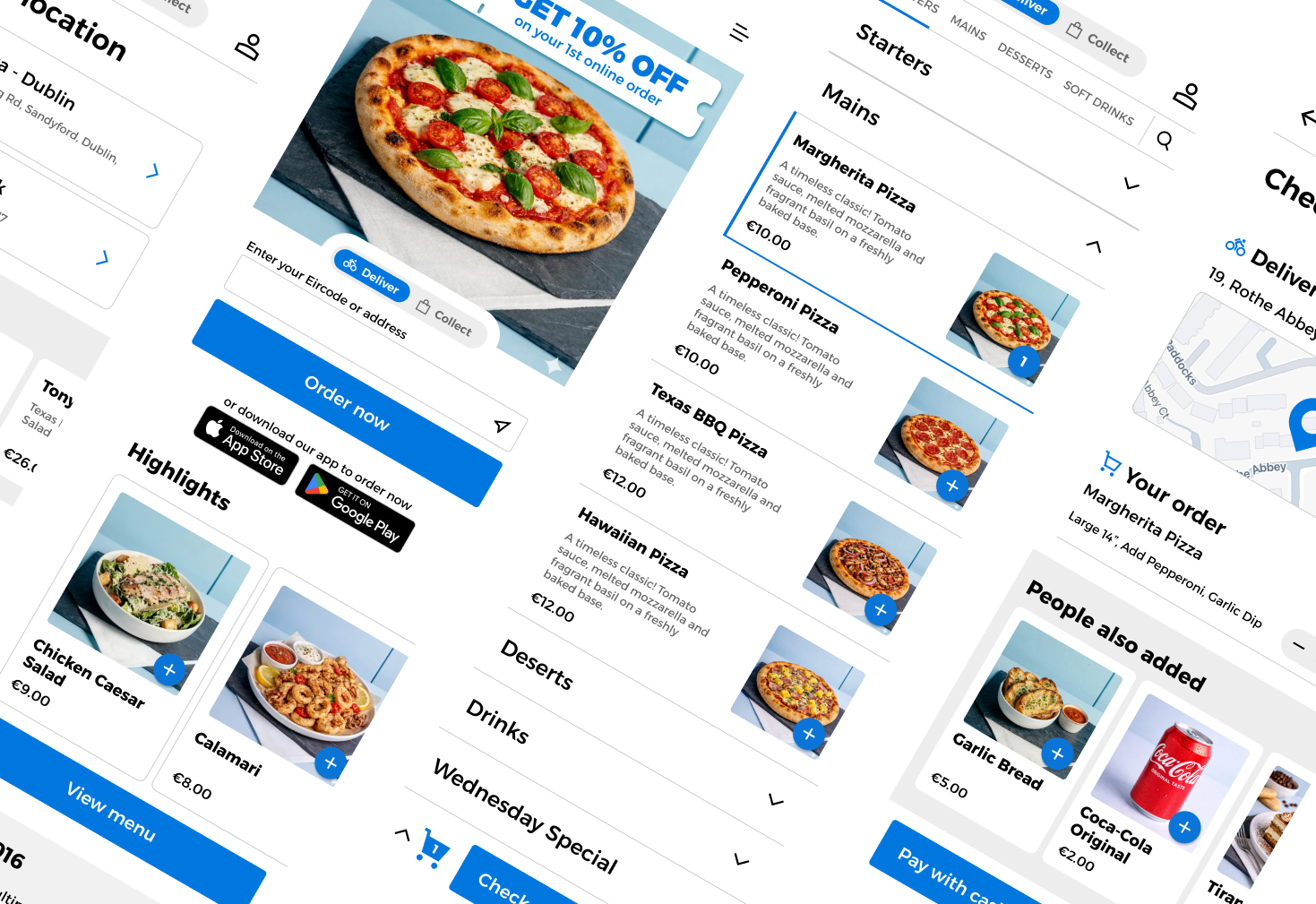
Flipdish case study cover
01

THE CHALLENGE

The Problem

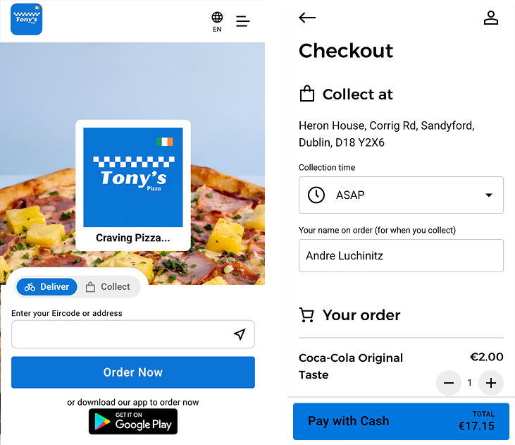
During my review of the ordering experience, I identified two key opportunities:

  • Inconsistent UI patterns across the product
  • A checkout flow with unnecessary complexity and navigation

These inconsistencies increase cognitive load, reduce user confidence, and make the experience feel less polished.

Goal

Create a more consistent, intuitive, and efficient ordering experience while maintaining scalability for future product growth.
02

DISCOVERY & UX AUDIT

Understanding the Experience

To identify the biggest usability opportunities, I performed a UX audit using:

  • Heuristic evaluation (Nielsen's usability principles)
  • UI component inventory
  • User flow analysis
  • Pattern consistency review

I then prioritised issues based on user impact, frequency, and implementation effort.

UNDERSTAND THE SYSTEM
BEFORE REDESIGNING
THE INTERFACE.
03

KEY FINDINGS

Main UX Opportunities

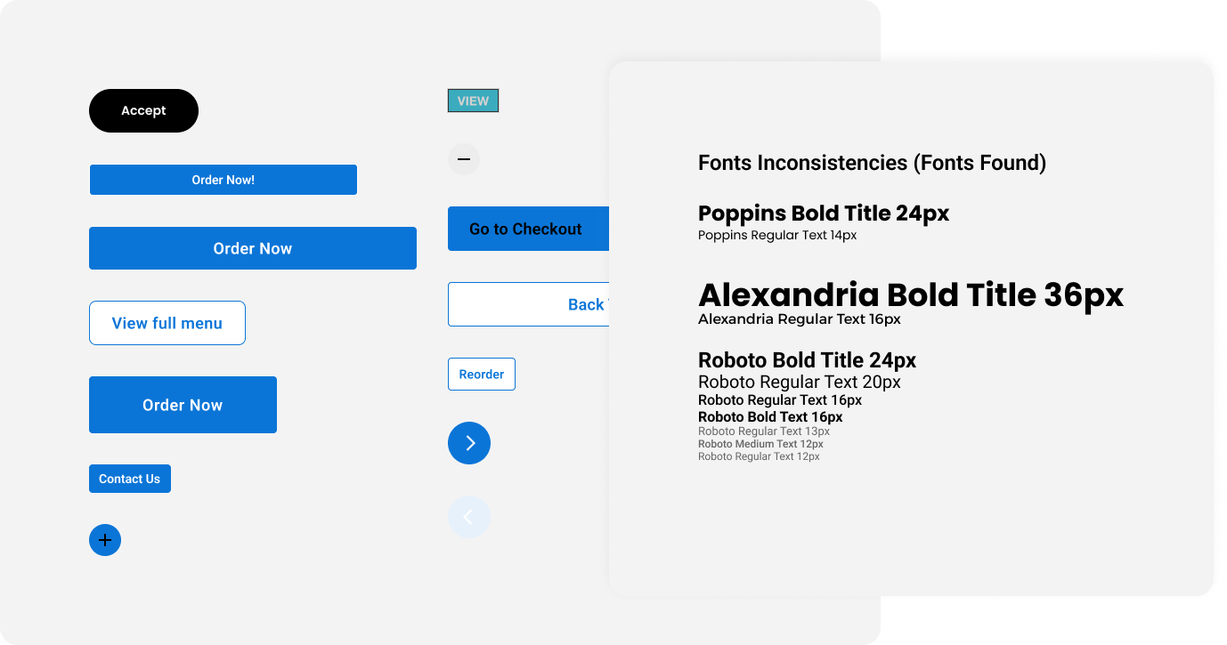
The audit highlighted several recurring issues:

  • Multiple button styles performing the same action
  • Inconsistent typography hierarchy
  • Uneven spacing and alignment
  • Different interaction patterns across similar screens
  • Checkout spread across multiple pages, increasing friction

Together, these issues create unnecessary cognitive effort and reduce the overall quality of the experience.
04

DESIGN PRINCIPLES

Every design decision was driven by five core principles.

01

Consistency

Create predictable interactions across the product.

02

Clarity

Reduce visual noise and improve information hierarchy.

03

Efficiency

Help users complete their order with fewer steps.

04

Scalability

Build reusable patterns that support future growth.

05

Accessibility

Improve readability, touch targets, and usability for all users.

05

UI STANDARDISATION

Creating a Consistent Design Language

I proposed a simplified component system with:
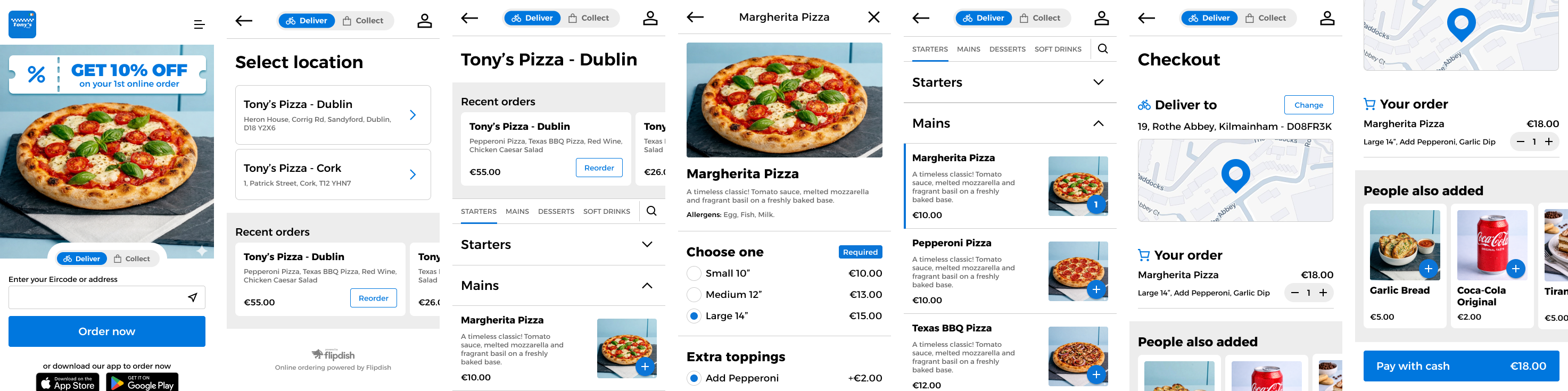
  • Standardised button styles
  • Consistent typography hierarchy
  • Unified spacing and layout rules
  • Reusable UI components

Expected Impact

  • Faster visual recognition
  • Increased user trust
  • Easier maintenance for designers and developers
  • More scalable design system
06

REDUCING CHECKOUT FRICTION

Simplifying the Checkout Journey

BEFORE

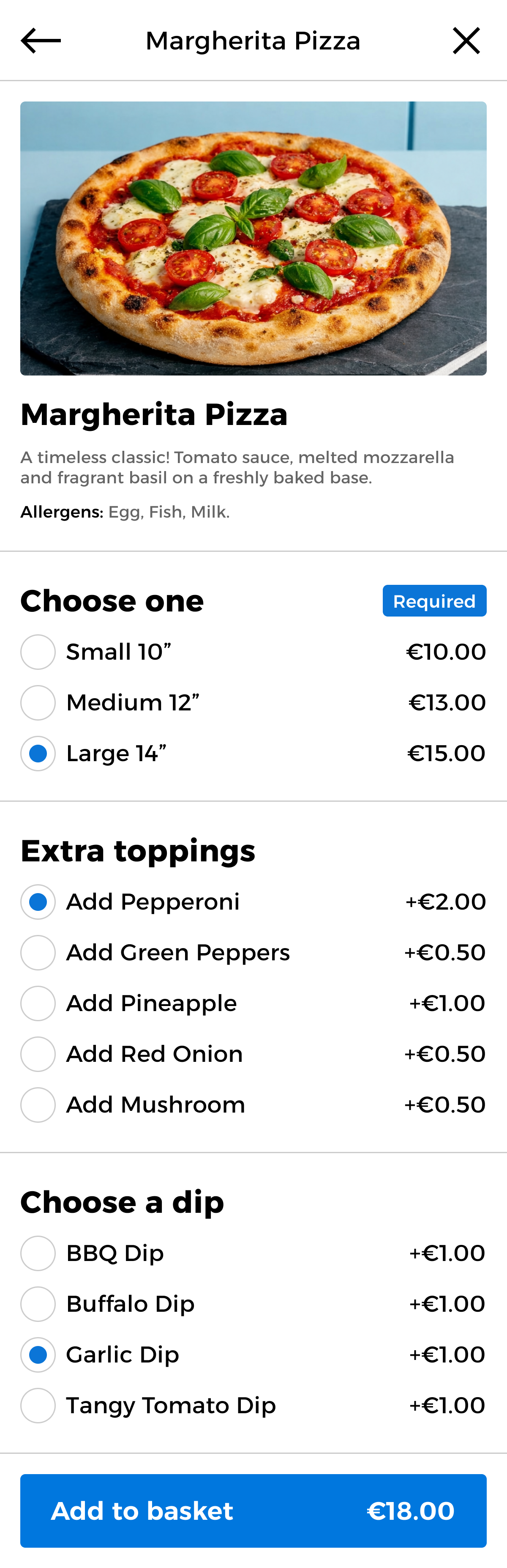
Users moved across multiple screens to complete a single task, increasing navigation effort and opportunities to abandon the purchase.

PROPOSED SOLUTION

Related actions are grouped into a single progressive interface that reveals information when needed.
Why This Works

  • Fewer navigation steps
  • Lower cognitive load
  • Better visibility of progress
  • Faster decision making

Expected Outcomes

  • Higher checkout completion
  • Reduced abandonment
  • Faster ordering experience
07

DESIGN VALIDATION

Measuring Success

Every design proposal should be validated with data.

Success Metrics

  • Checkout completion rate
  • Funnel drop-off analysis
  • Task completion time
  • Error rate
  • Customer satisfaction
  • Usability testing insights

Hypothesis

By reducing friction and increasing consistency, users should complete orders more quickly and with greater confidence.
Next Steps

  • Prototype and usability test the new flow
  • Measure performance using analytics
  • Iterate based on customer feedback
UX AUDIT & PRODUCT DESIGN EXPLORATION

FROM AUDIT TO A CLEARER,
MORE SCALABLE EXPERIENCE.

Back to recent work →