The existing experience lacked strong visual hierarchy and did not effectively highlight featured games.
POKERSTARS CASINO · PRODUCT EXPERIENCE
GAME OF
THE WEEK
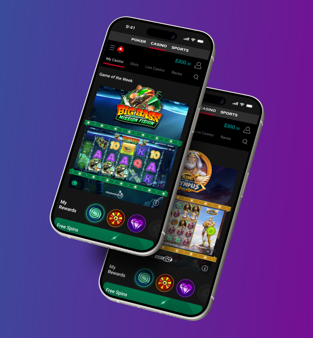
Redesigning a recurring promotional feature into a more immersive game-discovery experience — giving players a preview of the gameplay before they commit to opening the game.
MY ROLE
01 · THE PROJECT
FROM PROMOTION
TO PRODUCT EXPERIENCE.
The Game of the Week enhancement project focused on improving how featured games were promoted within the PokerStars experience.
The goal was to create a more engaging and visually impactful feature that increased discoverability and encouraged player interaction.
Rather than treating the module as another static campaign placement, the redesign explored how the promotion itself could communicate more of the game experience.
02 · THE CHALLENGE
MAKE THE FEATURED GAME
FEEL WORTH DISCOVERING.
Create a promotional feature that felt exciting, easy to navigate, and consistent with the wider PokerStars ecosystem.
Help players understand the visual character and excitement of a game before opening it.
03 · THE APPROACH
SHOW THE GAME,
DON'T JUST ADVERTISE IT.
I analysed the existing experience, explored multiple layout directions, and redesigned the feature with a stronger focus on clarity, relevance, and engagement.
The key insight was that players were more likely to interact with a featured game when they could preview the gameplay experience before opening the game itself.
KEY INSIGHT
Bring the game reels directly into the promotional experience.
This allowed players to immediately understand the game's visual style and created a stronger connection between promotion and play.
04 · EXPERIENCE DESIGN
A PROMOTION THAT
FEELS PLAYABLE.
Clearer hierarchy
Make the featured game and primary action immediately understandable.
Game reel previews
Expose the visual character of the gameplay directly inside the feature.
Stronger CTAs
Create more obvious, intentional paths from discovery into play.
Campaign flexibility
Support different games and creative directions without rebuilding the experience.
Scalable components
Create reusable UI patterns that can support future promotional campaigns.
05 · DESIGN THINKING
PERSONALISED VISUALS.
ONE SCALABLE SYSTEM.
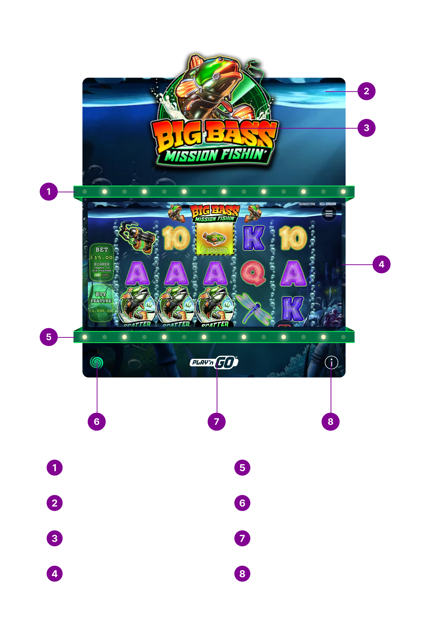
One of the most impactful improvements was the creation of an automated visual system for the Game of the Week feature.
By updating only the game logo and background artwork, the system automatically generated personalised animated frames around the reels using the predominant colours extracted from both assets.
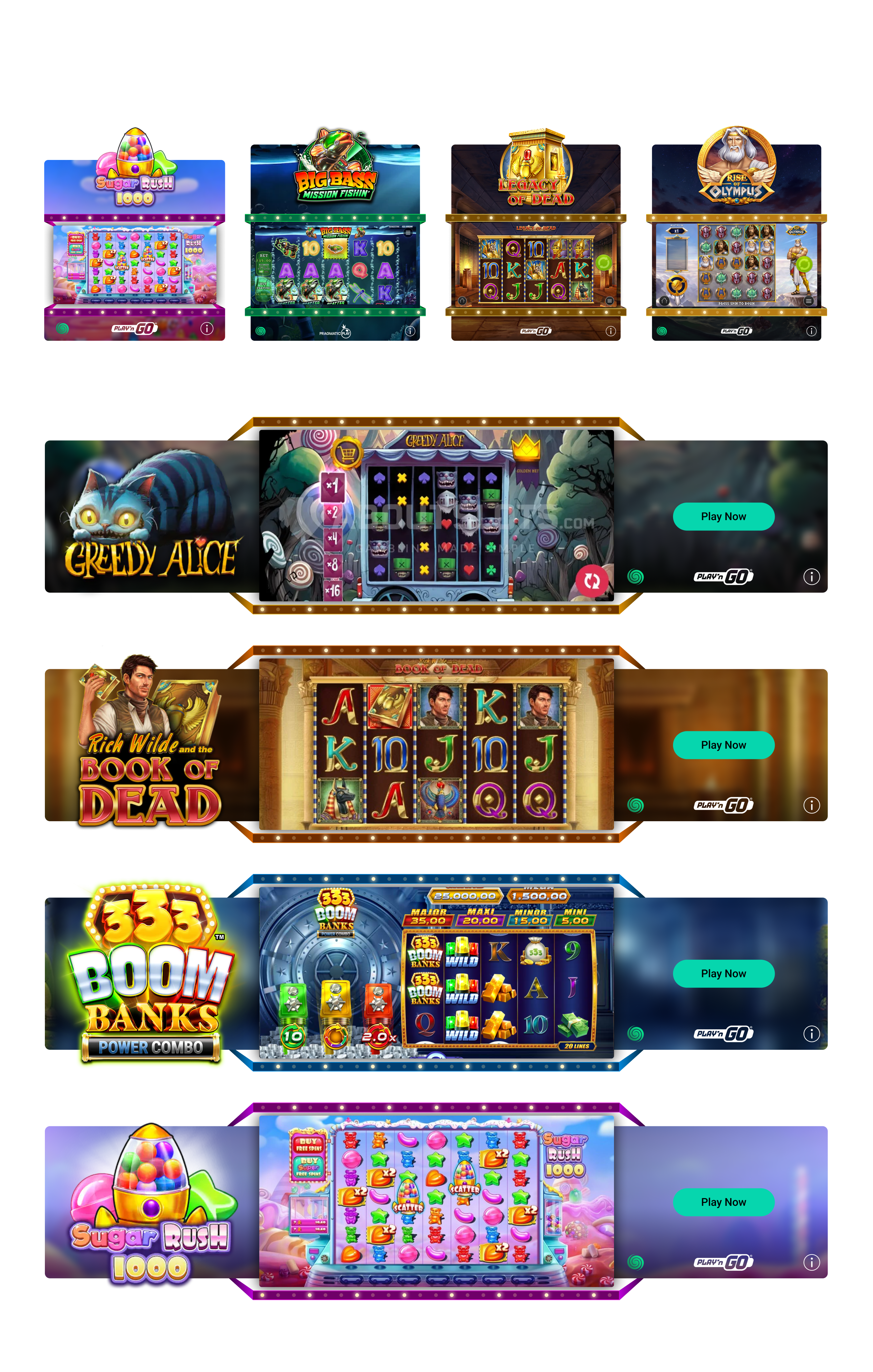
This made each featured game feel unique while preserving a consistent interaction model across the platform.
01GAME LOGO
+
02BACKGROUND
→
03ANIMATED FRAME
06 · FINAL EXPERIENCE
DESIGNED ACROSS
MOBILE + DESKTOP.
The final system was designed to remain visually impactful across responsive contexts while keeping the featured game, reel experience and call to action clear.
07 · OUTCOME
A SMALL FEATURE.
A MAJOR UPLIFT.
The redesigned experience delivered a significantly more engaging promotional feature and transformed how featured games were discovered and interacted with.
0%
MORE ENGAGING
DRAMATICALLY OUTPERFORMING THE PREVIOUS EXPERIENCE
VALIDATING THE IMPACT OF THE REDESIGN
Beyond the performance uplift, the project established a scalable framework for future promotional campaigns while demonstrating how UX thinking, visual design and automation can directly influence user behaviour and product performance.